LOGOS & BRANDING
|
Here is a sampling of logos below.
There are a couple in the works, too early to place on my site. A logo goes through a lot of transitions from beginning to final design. The larger the business, often, the more people are involved, and more ideas flow. This leads to changes and a |
wonderful honing-in on the companies ideals/mission statement, purpose/goals, and how these meld with their prospective clients. Designing a logo is not only a project, it is a multi-layered statement. Sometimes it is a really quick development, and other times it needs more process time to find its roots.
|
|
ORGANIC SPIRIT CENTRE
Organic Spirit Centre provides a safe space for clients to explore all that they are! Kimberly says it best, “It is the intention of the centre to create a space of resource which will allow a person to navigate for themselves the most appropriate route inward.” |
Kimberly’s business was already using the feather above. We wanted to create a logo that would integrate seamlessly, with the different arms of the business that will manifest as the business evolves into future plans. |
|
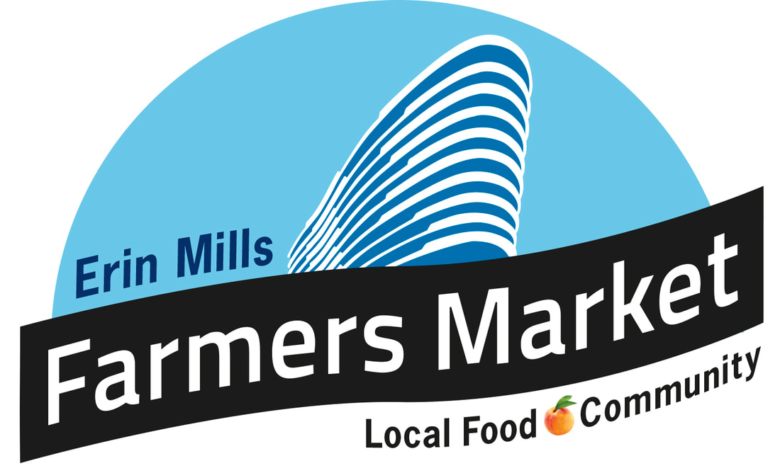
ERIN MILLS FARMERS MARKET
This logo was a joy to work on, and it was lovely to see how Daniels Corporation was working alongside the Erin Mills Farmers Market by offering space for the mostly organic market to bring awareness and "real food" right outside their residents buildings. And while the building was in the construction phase a separate garden area was created for residents to meet each other before the building was finished and to learn about sustainable gardening and again — get real food during the summer months through these years. The market is held under this particular building, The Arc, and with its round curvature it's easy to spot on the busy corner of a heavy flow, many-laned-street. With FB and Twitter using circular |
icons how could we meld with that, yet be a little different? We wanted a logo that would last, was more contemporary than some other market logos, and fit the high population area.
The market has the advantage of using removable signage while they are operating within this "suburban, commuter, mostly young professional" atmosphere to help bring people into the market. It is so important to keep our food chain "alive and well." There is a personal benefit in vitality. What are your local foods? How can you support local small farmers? What is the taste difference with something organic? It really can be quick to make your own meals and save more money for greater choices. It only takes a bit of organizing. |
|
|
|
BREATHING SPACE YOGA AND WELLNESS SERVICES
Dina Pereira is the business owner and is a yoga teacher and accupressurist who deeply cares for her clients' well-being — equal to her goal of having a business. Her beautiful space, with a welcoming outdoor garden before you enter, offers Yoga, accupressure, workshops, and reflexology, held by her and other teachers. Dina's business logo had to represent her views on alternative practices and convey her joy in seeing people find routes to wellness. |
I chose the background shapes often used in India's temple paintings to bring in nature, aspects of spirituality, and especially the idea of welcoming other cultures, a large part of Dina's personality. (The more people she sees in one room from different cultures, the happier she is!) The inclusion of the chakra system was important to her, and the added heart symbol portrays the place from which she strives to communicate with her students, plus a reminder to all of us that love radiates as a vibration that starts within, and from there we can harmonize.
|
|
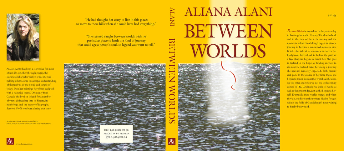
ALIANA ALANI (22shangrila.com)
It is best to let Aliana speak of herself. This comes from the above website. Enjoy a visit there to see her Gateways. "I am a writer, spiritual facilitator, and visual artist, specializing in the creation of sacred geometry templates. Born in the land of snow and maple leaves, I have travelled extensively.... I have a deep love of myth and story, its power and magic in our lives, and how it forms and colours all of our journeys." When Aliana asked me to design her logo I knew it had to be simple and direct, |
|
with the font having enough curve in it to keep things a little softer. Kind. Loving yet strong. Hence the serif usage.
The logo use is flexible. It can change colour (if desired), yet the alignment and colour percentages would have the same relationship. The letters can drop within an oval, a circle, and this softer square. For the spine of a cover, it is easily comprehended and the link to her name revealed. This book ended up being produced as an ebook and not a printed piece, but I loved the entire cover we had worked on. |
|
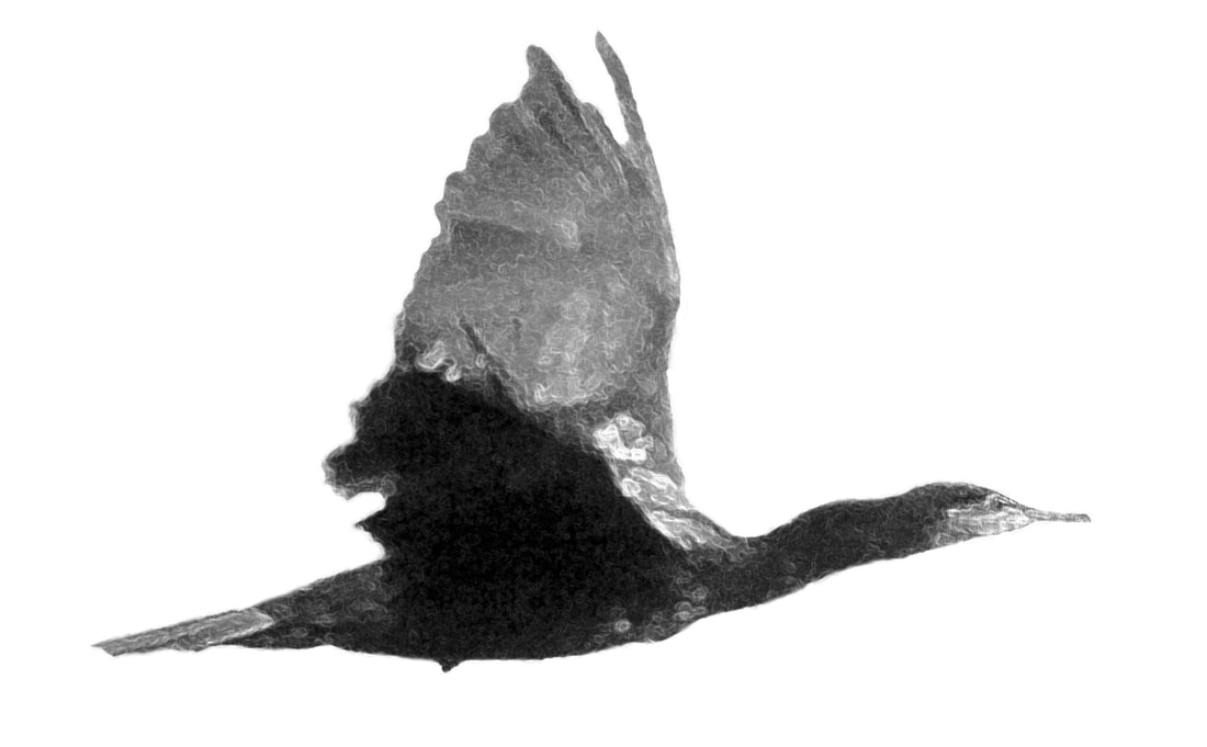
CORMORANT BOOKS
When Marc Côté became the new publisher for Cormorant Books I was asked to redesign the logo. The old logo was an image of a Cormorant, good for its time and more static in its representation. I wanted to keep the Cormorant yet create a more dynamic real-life image. I felt like Cormorant Books was a press that was beginning to move forward with new ideas with Marc at the helm. The press's authors are a diverse lot, with top-rated literary skills and this only got better over the years, with translated material done by Sheila Fischman and art books with Charlie Pachter and Margaret Atwood. Cormorant also added an imprint — DCB — for the children-young adult line where |
|
|
COMMUNITY SOLUTIONS LTD.
The owners of this business provide specialized support services for individuals with an aquired brain injury. We needed to know more about this type of business. At the time we had no personal family experience with these type of injuries and there was a lot to understand. Community Solutions Ltd. had already been in the area for some time when we took on this project and they still have a well-established network where they offer comprehensive personalized one-to-one services. Everything from Rehabilitation Assistants, Personal Support Workers/Attendants, ABI Support Groups to Life Skills Coaching, |
|
Academic/Educational Assistance and Tutoring, Personal Care, and much more.
We took on the challenge of designing a logo for this essential business. And a challenge it was. The logo went through many preliminary stages, some that focused more on community, others that leaned more toward a corporate image until a discussion and an insight had us do an 180-degree turn. It was a joy to land on the logo which we all could see now reflected their work — something that portrayed an individual being able to integrate back into their own homes and the community in which they live — as much as possible. |
|
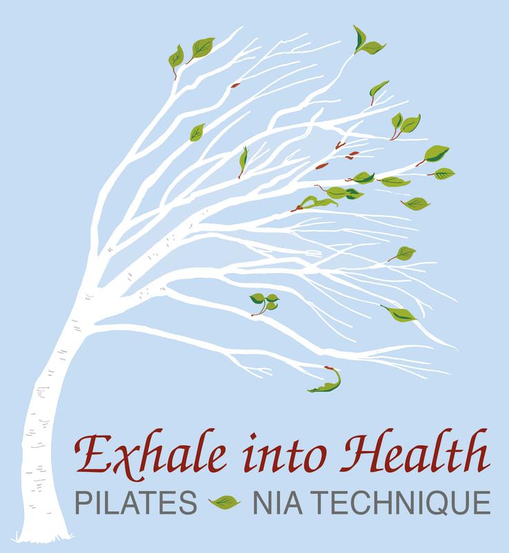
EXHALE INTO HEALTH
This client taught mainly Nia & pilates when she first started her business in Port Hope (and I believe she is still teaching in the area). She was an excellent Nia instructor, exuding a love for people and she had a large vision which needed a logo. She already had the image in her mind and pilates focuses on the exhale with a concentration on abdominal muscles — hence the sway of the tree. (And you need a lot of good breathing to keep dancing Nia as much as she did!) The birch tree was asked for in particular, with only a few leaves to represent the beginnings of spring — that newness and the vitality that breaks open with this season. A lot like her exuberance in this new business undertaking! Exhale into Health was the original client's type choice and so I chose a clean san serif to make sure there was enough contrast for it to stand out. Another serif would have been tough with this font. I used the element of the leaf to separate type and make it easier to read by compartmentalizing information when we did more advertising for workshops, or created posters and flyers. |
|
|
Enchanted Hands asked for a stylized usage of the letters of their name to create a more contemporary, updated look for their newly renovated Day Spa situated in Bowmanville, ON.
|
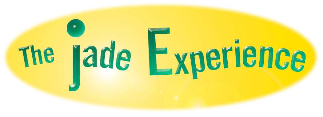
The Jade Experience was a business located in Port Hope, ON. The business rented time to clients to use specialized beds with rolling jade balls that gave a relaxing, hands-off massage experience.
|
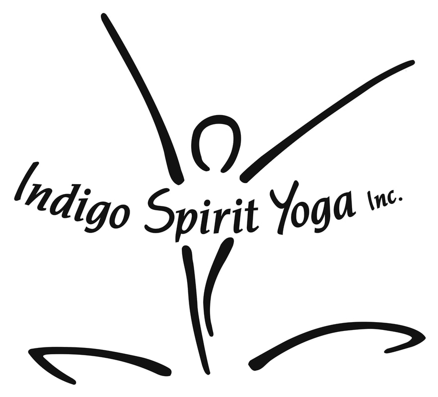
Indigo Spirit Yoga Inc. was created from a sketch for a yoga studio in Port Hope that hosted a group of terrific teachers.
|